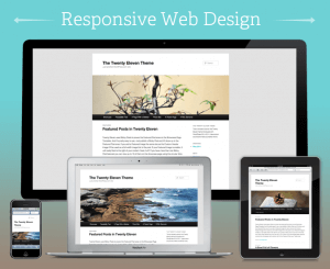
 This website and blog are my first attempts at creating a responsive website. This website will change its look to be optimized for any reasonable screen size, from smart phones to desktop computers.
I used the CSS media queries method to adjust the styling of different elements of this website on different size screens.
It isn’t perfect by any means, but you can’t learn something without trying. If you do notice some problems or just have comments on improving this page, please leave me a comment on this post.
Recent Comments