My supervisor had a really good idea for our new company internal website: a timeline of our company’s history. It is a 100+ year old company so it really makes sense to create an interactive timeline, especially for the benefit of new employees (like myself). So, naturally, I googled “CSS Timeline” to see what is out there already.
 Mostly I found horizontally scrolling timelines, many of which required some Javascript or jQuery. I already had a couple jQuery plugins for this company website, and I didn’t want to have to deal with plugins interfering with each other (plus the CMS doesn’t give you a lot of freedom to extend functionality like this). Also, I love just doing things with basic HTML and CSS. Simple is usually better.
Some vertical CSS timelines I found were nice, but not degradable down to older browsers or they were boxy and ugly. So I decided to make my own, based somewhat on a cool concept for an organizational chart. I made it straightforward, semantic, and browser compatible all the way back to IE7. It is also responsive to different browser window sizes (you can actually read it in a mobile browser).
The HTML is very simple. For the sake of semantics, I used ordered lists (timelines flow in order). First I ordered the top “Jump Strip” bar for easy access to decades.
 <div id="jumpstrip"> <ol>
     <li><a href="#1900s">1900s</a></li>
		<li><a href="#1910s">1910s</a></li>
		<li><a href="#1920s">1920s</a></li>
		<li><a href="#1930s">1930s</a></li>
		<li><a href="#1940s">1940s</a></li>
		<li><a href="#1950s">1950s</a></li>
		<li><a href="#1960s">1960s</a></li>
		<li><a href="#1970s">1970s</a></li>
		<li><a href="#1980s">1980s</a></li>
		<li><a href="#1990s">1990s</a></li>
		<li><a href="#2000s">2000s</a></li>
		<li><a href="#2010s">2010s</a></li>
    </ol>
</div>
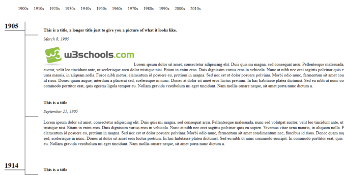
Then I coded the <ol> for the actual timeline entries. I made a .title, .date, and .history class for each entry and .year for fewer than every entry (if 2 or more things happen in the same year). Each entry div is wrapped in a link element that can be removed, linked to a page, or linked to a lightbox (or lightbox related plugin) to add more content. I used this with shadowbox to add larger photos or videos when I implemented this at my place of employment.
<div class="timeline">
			<ol>
				<li>
				<span class="year" id="1900s">1905</span>
                 <a href="#"><div class="entry">
						<div class="title">This is a title, a longer title just to give you a picture of what it looks like.</div>
						<div class="date">March 8, 1905</div><br />
						<span class="history"><img src="http://www.w3schools.com/images/w3schoolslogo.gif" alt="picture" />Lorem ipsum dolor sit amet, consectetur adipiscing elit. Duis quis mi magna, sed consequat arcu. Pellentesque malesuada, nunc sed volutpat auctor, velit leo tincidunt ante, ut scelerisque arcu dolor tristique nisi. Etiam in enim eros. Duis dignissim varius eros in vehicola. Nunc at nibh nec orci sagittis polvinar quis eu sapien. Vivamus vitae urna mauris, in aliquam nolla. Fusce nibh metus, elementum id posuere eu, pretium in magna. Sed nec est ut dolor posuere polvinar. Morbi odio nunc, fermentum sit amet condimentum nec, faucibus id risus. Donec quam augue, interdum a placerat sed, scelerisque in nunc. Donec at dolor sit amet eros luctus pretium. In hac habitasse platea dictumst. Sed eu nibh ut nunc commodo suscipit. In commodo porttitor erat, quis egestas ligola tempor eu. Nollam gravida vestibolum mi eget tincidunt. Nam mollis ornare neque, sit amet porta nunc dictum a.</span>
					</div></a>
				</li>
				<li>
		<a href="#"><div class="entry">
						<div class="title">This is a title</div>
						<div class="date">September 21, 1905</div><br />
						<span class="history">Lorem ipsum dolor sit amet, consectetur adipiscing elit. Duis quis mi magna, sed consequat arcu. Pellentesque malesuada, nunc sed volutpat auctor, velit leo tincidunt ante, ut scelerisque arcu dolor tristique nisi. Etiam in enim eros. Duis dignissim varius eros in vehicola. Nunc at nibh nec orci sagittis polvinar quis eu sapien. Vivamus vitae urna mauris, in aliquam nolla. Fusce nibh metus, elementum id posuere eu, pretium in magna. Sed nec est ut dolor posuere polvinar. Morbi odio nunc, fermentum sit amet condimentum nec, faucibus id risus. Donec quam augue, interdum a placerat sed, scelerisque in nunc. Donec at dolor sit amet eros luctus pretium. In hac habitasse platea dictumst. Sed eu nibh ut nunc commodo suscipit. In commodo porttitor erat, quis egestas ligola tempor eu. Nollam gravida vestibolum mi eget tincidunt. Nam mollis ornare neque, sit amet porta nunc dictum a. </span>
					</div></a>
				</li>
                                ...
The CSS is broken down to the #jumpstrip and the #timeline ids. The jump strip is very straightforward and is pretty much the nav bar on this website. The majority of the CSS is purely to make the timeline display correctly and it should adapt and inherit the parent styles on the page. If you know how to write CSS, by all means style this thing up!
#jumpstrip li {
	display:block;
	}
#jumpstrip {
			float: left;
			margin-top:25px;
			font-size:16px;
			font-family: inherit, sans-serif;
			color:black;
			padding-left: 25px;
			clear:both;
			padding-bottom: 25px;
				}
#jumpstrip li{
			position: relative;
			float: left;
			list-style: none;
			margin: 0px;
			padding:0px;
			}
#jumpstrip li a{
			display: block;
			text-decoration:none;
			font-size:16px;
			padding: 10px;
			padding-top:20px;
			color:black;
			border-bottom: 5px solid transparent; /* if making for IE 6 transparent won't work.  See http://snippets.dzone.com/posts/show/6089 for solution */
			}
#jumpstrip li a:hover{
			color:green;
			border-bottom: 5px solid #22241C;
			}
The timeline styling pulls the GIF for the lines and positions the year left and the entries right.
#timewrap {
	padding-left:50px;
	max-width:90%;
	float:left;
	}
.timeline a, .entry a, .entry {text-decoration:none;color:black;}
.timeline li a:hover {
    text-decoration:none;
}
.timeline li,
.timeline ol li {
	list-style:none;
}

.timeline,
.timeline ol,
.timeline ol ol {
	margin:0;
	padding:0;
}
.timeline ol li {
	padding:0 0 0 50px;
	margin:0 0 0 50px;
}
.timeline li a {
	position:relative;
	top:-50px;
	}
.timeline li div.entry {
	padding:20px;
	margin:0;
	border-style:none;
}
.timeline li a .entry:hover, .timeline .entry:hover {
	background-color:#e8e8e8;
	text-decoration:none;
	color:black;
}
.timeline ol li {
	background:url('images/org-tree-mid.gif') no-repeat left top;
}

.timeline ol li.last {
	background:url('images/org-tree-last.gif') no-repeat left top;
}
/*----------- Main Content Elements ---------------- */
.date {font-style:italic;}
.year {  /* this is the year on the left side.  If you decide to add a month or other content, adjustments will need to be made. */
	font-weight:bold;
	display:block;
	position:relative; /* for browser (IE) compatability */
	width: 75px;
    border-bottom: 2px solid #666666;
    font-size: 1.6em;
    right:125px;
}
.title {
	padding:0 0 10px 0;
	font-weight:bold;
	font-style:normal;
	line-height:1.6em;
	}
.history { /* I didn't really style this, it is here for posterity. */
	font-family:inherit;
	}
Here’s the download and a demo.
If you have any questions or notice any discrepancies, let me know in the comments!
UPDATE: To accommodate longer timelines, you can position:fixed the #jumpstrip to the bottom:
#jumpstrip {
    position: fixed;
    background-color: #dedede;
    z-index: 999;
    max-width: 700px;
    bottom: 10px;
    box-shadow: 0px 3px 5px 0px black;
    border-style: solid;
    border-color: black;
    margin-left: 15%;
    margin-right: 15%;
    padding-top: 5px;
    padding-bottom: 5px;
    }
or you can do what I did for my job: create a “Top” button that will put you back on the top of the page:
#top {
	position:fixed;
	bottom:25px;
	right:25px;
	background-color: #454545;
    z-index: 999;
    box-shadow: 0px 3px 5px 0px black;
	padding:10px;
	font-size:16px;
	font-family:inherit, sans-serif;
	color: #ffffff;
    font-weight: bold;
	}
#top a {color: white;}
#top a:hover {color: #53beff;}
#top:hover {background-color:#242424;}
Note: These last two bits of code are not in the demo.
Recent Comments